[Menu Skins] The Wicked Series (6 colours, meaner than Mean)
Moderators: Nexuiz Moderators, Moderators
35 posts
• Page 2 of 4 • 1, 2, 3, 4
![]() by The mysterious Mr. 4m » Mon Aug 04, 2008 12:04 pm
by The mysterious Mr. 4m » Mon Aug 04, 2008 12:04 pm
wicked_"clean"? so i assume the colors will be adjustable?
4m [PB] (amoebios)
This is Your world.
This is Your world.
- The mysterious Mr. 4m
- Forum addon
- Posts: 1402
- Joined: Wed Mar 01, 2006 6:03 pm
- Location: germany
![]() by [-z-] » Wed Aug 06, 2008 5:11 pm
by [-z-] » Wed Aug 06, 2008 5:11 pm
[restructured from the conversation on #alientrap]
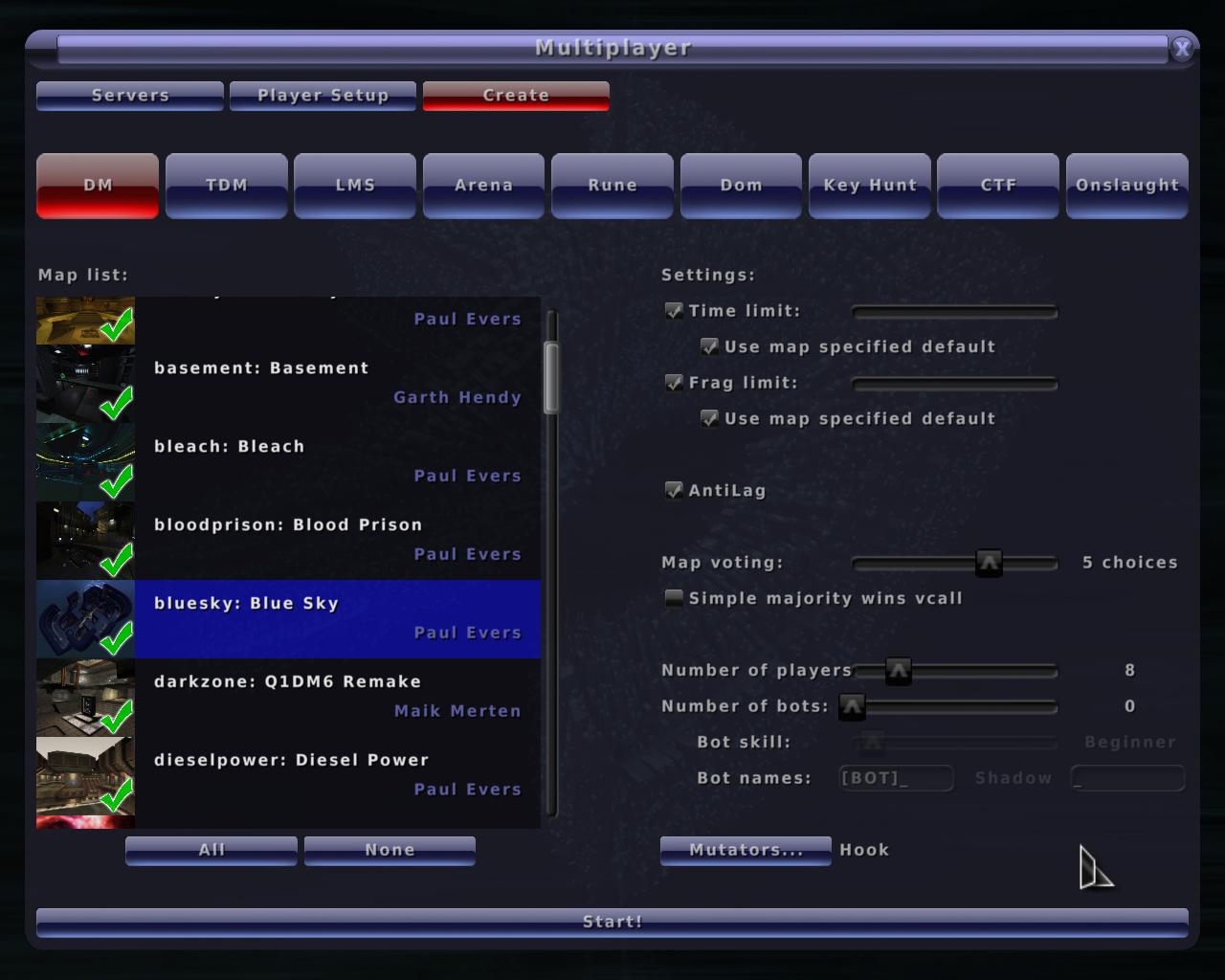
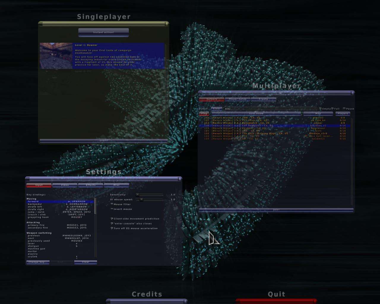
I think it's a good base but some of the elements in the gui need clarification. If we're speaking in terms of usability, I'd say it's a step backwards.
Scroll bars, sliders and checkboxes, all lack contrast and definition against the background. This can be confusing to any user, new or old.
The checkboxes, the buttons and the inside of the main window are all square, which makes it a bit boring. Sure the insides of the buttons have some interesting details but the game type buttons are obviously stretched, something the 2.4 default theme hid pretty well. I'd go as far to say if this is going to be the new standard theme, it requires a code change to give game types a different background, otherwise it just looks bad.
The selected map has a white background, which make white text with a black shadow hard to read.
I think the blue theme is a better starting point but the contrast of the form elements must must must change.
- [-z-]
- Site Admin and Nexuiz Ninja
- Posts: 1794
- Joined: Mon Nov 13, 2006 12:20 am
- Location: Florida


![]() by HarryButt » Wed Aug 06, 2008 5:29 pm
by HarryButt » Wed Aug 06, 2008 5:29 pm
IF I would change something on the blue theme, it would be a little stitch of green into the control elements.
I don't mind the contrast of the buttons to the BG, what I see is the contrast of the text itself. Imo it's not full white, though I may be wrong.
I don't mind the contrast of the buttons to the BG, what I see is the contrast of the text itself. Imo it's not full white, though I may be wrong.
I'M BATMAN!
- HarryButt
- Keyboard killer
- Posts: 560
- Joined: Thu Jan 17, 2008 4:51 pm
- Location: Hamburg, Germanistan
- KillaGrunt
- Alien trapper
- Posts: 315
- Joined: Fri Jun 27, 2008 3:35 am
- Location: In your X-Box 360 playing halo
![]() by sev » Wed Aug 06, 2008 8:08 pm
by sev » Wed Aug 06, 2008 8:08 pm
These are my interpretations of a menu skin. Of course, you do not have to use them.
What I intended to do was to create some atmosphere, which the old ones completely lack, in my opinion. They should look dirty, and I reference to the evil textures (they are derived from evil textures), and in this way making the menu look like the maps that are played, creating a more consistent overall look.
I use Wicked Yellow for quite some time now and do not have any problem with the contrast. Wicked White has a quite good contrast if that's what you are looking for.
- sev
- Alien
- Posts: 248
- Joined: Sat Mar 29, 2008 3:03 pm
- Location: Switzerland
![]() by [-z-] » Wed Aug 06, 2008 8:21 pm
by [-z-] » Wed Aug 06, 2008 8:21 pm
I wasn't trying to insult your work, I was giving your my opinions on how it can be improved. What you see and everyone else sees are not always the same thing. You want to try and hit the widest range of people you can within a respective realm of interest, in this case, usability.
I posted my comments because MrBougo had informed me that it was checked into SVN. While I think this is a change in a positive direction, going more towards the original grungy look the team was aiming for, I feel the usability has dropped from its plasticy predecessor.
I believe implementing my suggestions will help improve the problems I've described in my previous post.
- [-z-]
- Site Admin and Nexuiz Ninja
- Posts: 1794
- Joined: Mon Nov 13, 2006 12:20 am
- Location: Florida
![]() by KillaGrunt » Wed Aug 06, 2008 8:31 pm
by KillaGrunt » Wed Aug 06, 2008 8:31 pm
No sev thats not what I ment. I was trying to say that I can't use them . I did menu_skins wickedgreen but it seems that I put them in the wrong folder. And i did do menu_restart.
- KillaGrunt
- Alien trapper
- Posts: 315
- Joined: Fri Jun 27, 2008 3:35 am
- Location: In your X-Box 360 playing halo

![]() by sev » Wed Aug 06, 2008 8:41 pm
by sev » Wed Aug 06, 2008 8:41 pm
KillaGrunt wrote:No sev thats not what I ment. I was trying to say that I can't use them . I did menu_skins wickedgreen but it seems that I put them in the wrong folder. And i did do menu_restart.
It's "menu_skin wickedcolour" and "menu_restart".
Did you put it in the data folder? In the right folder, there should also be the data20080511.pk3 file (if you use Nexuiz 2.4.2).
Maybe you want to try to change the key "seta menu_skin" in the config.cfg file to "wickedcolour".
- sev
- Alien
- Posts: 248
- Joined: Sat Mar 29, 2008 3:03 pm
- Location: Switzerland
35 posts
• Page 2 of 4 • 1, 2, 3, 4
Who is online
Users browsing this forum: No registered users and 1 guest