NetRadiant entities eyecandy + poll

For now: Everything about NetRadiant

Moderator: Moderators

Which entity model you like the best?

Simple cube with logo
0
No votes
Arrowed cube
2
18%
Simple cube with logo but transparent
1
9%
Arrowed cube but transparent
0
No votes
Arrowed cube but transparent and has logo too
7
64%
None of them, leave it alone as it is! (or at least re-colorise those which share the same shades)
1
9%
 
Total votes : 11

NetRadiant entities eyecandy + poll

Postby C.Brutail » Sun Nov 16, 2008 10:03 pm

Few days ago tZork and me were talking about entities in NetRadiant (and GtkRadiant in general), that the entities we see in the editor are not very intuitive and they are pretty ugly too.
So I've decided to change this, and if you like it, it *might* end up in NetRadiant too, if divVerent accepts my patch.
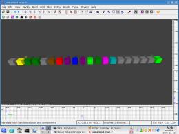
On this very picture, you can see the actual problem: entities are only dull boxes, with different shades of colors. Not to mention, some of them share the same color:
Image

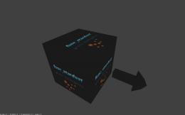
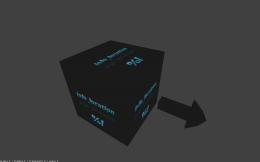
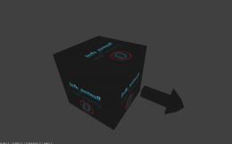
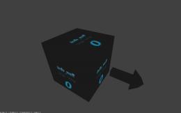
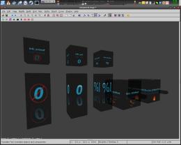
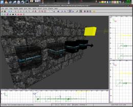
So I've decided to make models for them. I've stayed at the box shape (I'm too much used to it, and those boxes give me a pretty accurate point where the center is :) ), but I've made some ASE models, and in gimp I've textured them in Web2.0 style (that's the trend nowadays :P ) :
Image

These are actually func_pointparticles entities (that one requires patch in Nexuiz SVN too btw). I've decided to make 4 different types, plus a 5th in my mind that I was just too lazy to make :P

The poll is about, wich one do you like the best? The first one in the far, is obviously the old entity. The second one in row has the text "func_pointparticle" text on all of it's side, and a logo on it's front face (so you can see the angle in 3D view). Drawback: you can only see where it looks in the 3D window.
The second one has an arrow, but it doesn't have the logo.
The two last ones are the same, but they're 60% transparent.
The 5th would be the transparent arrowed AND has logo on all sides (that'd b my fav I think :D ), but I'd like to ask all of you mappers what you'd like to see in your editor. Sure, this adds a little more work for your pc to render, but those models are really low poly, and I don't think that it'd hurt performance on todays' computers anyway.
So please, tell me your opinions, and vote!

ps.: I'll do models for eg. spawn points too, a stick man with a gun in it's hand or something similar.
"One should strive to achieve; not sit in bitter regret."
WE ARE NEXUIZ.
Image
Image
C.Brutail
Laidback mapper
 
Posts: 2357
Joined: Tue Feb 28, 2006 7:26 pm
Location: Ironforge

Postby MirceaKitsune » Sun Nov 16, 2008 10:37 pm

For some reason I can't seem to vote on the pool. Either way my vote was for none of the pool options actually, since I believe the best way would be if each entity had a model and texture rather then that classic cube. For example, a light entity would have a model and a texture like a bulb instead of that round sphere, while a target_speaker a speaker model and texture and so on. Would probably be a bit more difficult to make but yeah that's just what I think if it is possible...
MirceaKitsune
Keyboard killer
 
Posts: 593
Joined: Thu Aug 14, 2008 6:48 am
Location: Romania - Bucharest

Postby C.Brutail » Mon Nov 17, 2008 12:08 am

:D

Image

Image

Image

Image

Image
"One should strive to achieve; not sit in bitter regret."
WE ARE NEXUIZ.
Image
Image
C.Brutail
Laidback mapper
 
Posts: 2357
Joined: Tue Feb 28, 2006 7:26 pm
Location: Ironforge

Postby [-z-] » Mon Nov 17, 2008 12:09 am

yay, looking good.

Maybe different color boxes or text though so you can tell the difference at a distance.
[-z-]
Site Admin and Nexuiz Ninja
 
Posts: 1794
Joined: Mon Nov 13, 2006 12:20 am
Location: Florida

Postby torus » Mon Nov 17, 2008 1:06 am

Brutail- lose the extra detail on the end of the arrow. It's unnecessary imo.
Image
torus
Forum addon
 
Posts: 1341
Joined: Sun Dec 24, 2006 6:59 am
Location: USA

Postby divVerent » Mon Nov 17, 2008 6:35 am

Better keep the arrows as is for performance reasons.

On another note: func_pointparticles is meant to be a brush entity that spawns point particles at some random point inside the brush in random intervals. So you can't simply use a model to render it.

The changes are nice otherwise...
1. Open Notepad
2. Paste: ÿþMSMSMS
3. Save
4. Open the file in Notepad again

You can vary the number of "MS", so you can clearly see it's MS which is causing it.
divVerent
Site admin and keyboard killer
 
Posts: 3809
Joined: Thu Mar 02, 2006 4:46 pm
Location: BRLOGENSHFEGLE

Postby Alien » Mon Nov 17, 2008 7:21 am

Drawback: you can only see where it looks in the 3D window.

+1 to all C.Brutails models, which have no such drawback. Models with this drawback would be annoying.
Alien
Forum addon
 
Posts: 1212
Joined: Tue Apr 22, 2008 7:12 am

Postby Strahlemann » Mon Nov 17, 2008 2:57 pm

Great that you're doing this C.Brutail!

I'd suggest using different colors for the boxes,too (e.g. all func_ boxes are yellow, all info_ boxes green etc.).
I like the symbols. Make them bigger, so that you can tell faster from the distance what entity you're looking at.
To have more room for the symbol you could use abbreviations for the entities (F_PP for func_pointparticles or F_SD for func_stardust etc LOC for info_location and NLL for info _null or similar etc..) You'll still be able to see what exactly the entity is by opening the entities window.
And i think that arrows on the boxes only make sense for entities that use directions.

Will you do entity-models for the weapons too ?
please :roll:
bleach->aneurysm->straledm5->dieselpower->space-fun->o-fun->runningman->runningman1on1->aggressor(conversion)->soylent->bloodprison->bluesky->ruiner->reslimed->strength
Strahlemann
Keyboard killer
 
Posts: 676
Joined: Wed Mar 01, 2006 12:11 am
Location: Ulm/Germany

Postby C.Brutail » Mon Nov 17, 2008 4:14 pm

Strahlemann, if you use netradiant, or copy the entities.def from Nexuiz SVN, you'll be already able to see the weapons as they're ingame :)
"One should strive to achieve; not sit in bitter regret."
WE ARE NEXUIZ.
Image
Image
C.Brutail
Laidback mapper
 
Posts: 2357
Joined: Tue Feb 28, 2006 7:26 pm
Location: Ironforge

Postby C.Brutail » Mon Nov 17, 2008 4:48 pm

Progress :)

I've removed the feathers of the arrows, but the arrow itself is still there.
info_* entities now form an i letter:

Image
"One should strive to achieve; not sit in bitter regret."
WE ARE NEXUIZ.
Image
Image
C.Brutail
Laidback mapper
 
Posts: 2357
Joined: Tue Feb 28, 2006 7:26 pm
Location: Ironforge

Next

Return to NetRadiant - General Discussion

Who is online

Users browsing this forum: No registered users and 1 guest

cron