Looking at all these mockups made me realize what bugged me the most when I was trying Ubuntu. It was the default system font. It may sound weird, but imo this was the ugliest thing on Ubuntu, and it was never changed. I hope, that they finally included a more reader-friendly font, where the words don't look as if they were smacked a n d t h a t s p a c i n g s u c k e d t o o . Of course, you could change the default font and skin and everything, but as a noob to Linux in general this is the stuff that made me feel not right from the start.
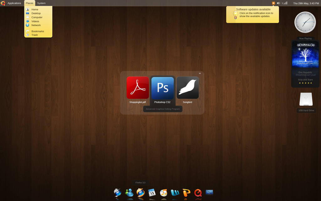
Now here's some interesting stuff.
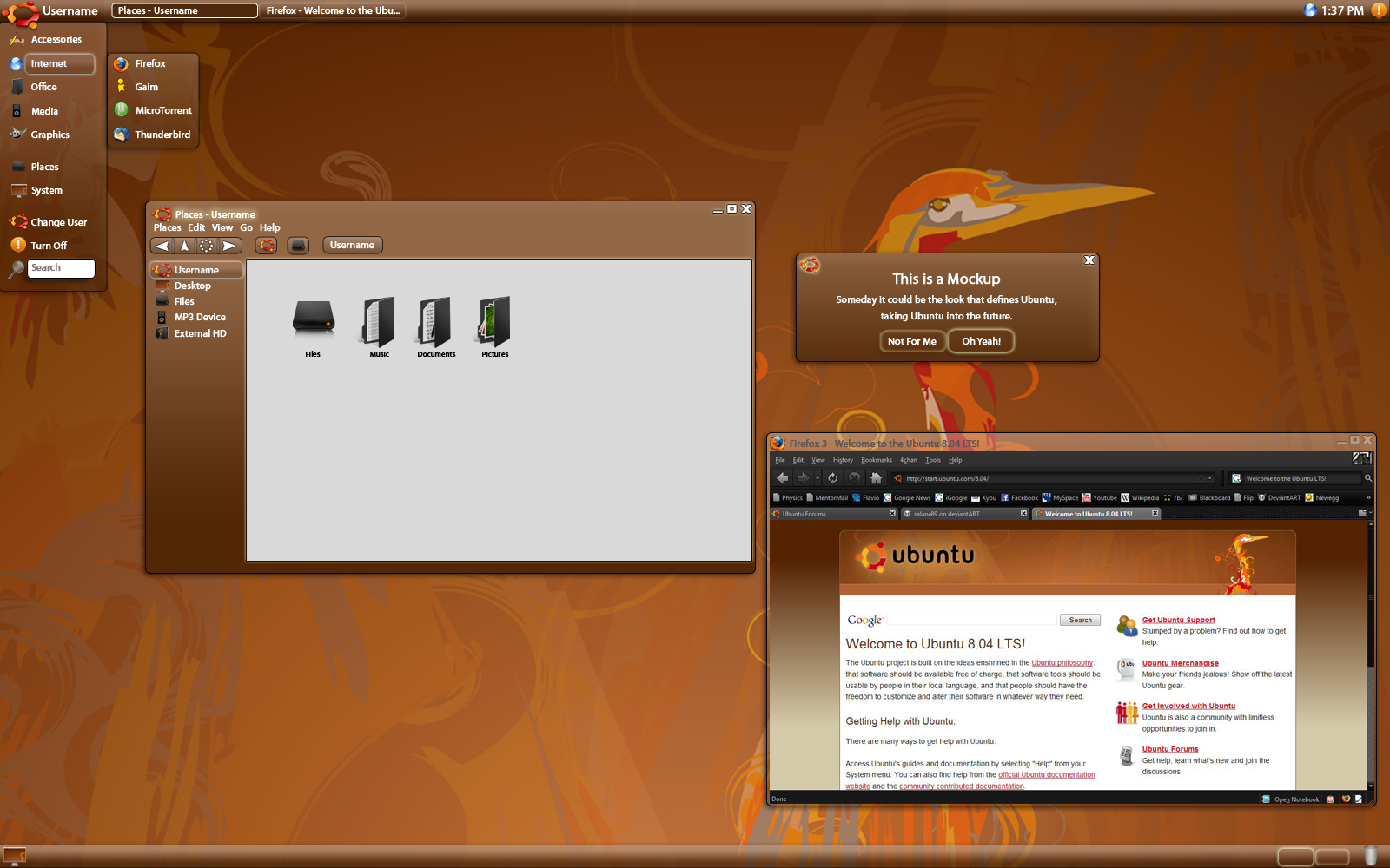
First mockup, I assume
Clear Intrepid
Good Dark Theme
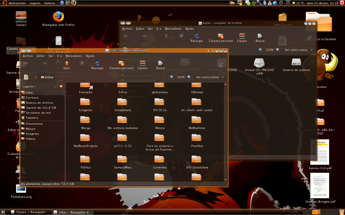
Dark Orange
Sharp Chocolate
Silver Wings
Ubuntu Dark #1
Ubuntu Dark #2
Ubuntu Dust
Dunno the name

All this can be found at https://wiki.ubuntu.com/Artwork/Incoming/Intrepid/
This seems like the final skin and looks pretty cool to me. I'm seriously considering to get this thingie on my not-yet-existant laptop.
