Well, low contrast is also bad for the eyes, as it makes reading the text harder.
One thing I really hate is that even on current systems, the font suddenly changes from thin to thick when upping the font size. When I change it to 120% of the current size, it's all perfectly readable. But this is just the font size then where it changes from 1px thick to 2px thick (and it's actually why it looks better).
Too bad using page zoom also makes images larger, which looks very ugly.
As for "You can always edit it client side." - is there any "user friendly" way to do that? I know I can use the user style sheet feature and manually write a CSS file, but I bet I'm not the only user who has a hard time reading text at that low contrast and thin font.
Also, when I try to increase the font size to a sensible value, I get problems with the line height, as you somehow broke the line height increasing together with the font size.
EDIT: while I was writing this, I noticed that when now switching to Verdana instead of Bitstream Vera Sans, it actually looks good. Can you do that in the CSS, so everyone can get a nice readable font?
Another thing... can you now also increase the line height? When selecting text, the selection marking overlaps the previous line...
I've been working on a new theme for the AT forums
Moderator: Moderators
![]() by divVerent » Wed Apr 01, 2009 12:25 pm
by divVerent » Wed Apr 01, 2009 12:25 pm
1. Open Notepad
2. Paste: ÿþMSMSMS
3. Save
4. Open the file in Notepad again
You can vary the number of "MS", so you can clearly see it's MS which is causing it.
2. Paste: ÿþMSMSMS
3. Save
4. Open the file in Notepad again
You can vary the number of "MS", so you can clearly see it's MS which is causing it.
- divVerent
- Site admin and keyboard killer
- Posts: 3809
- Joined: Thu Mar 02, 2006 4:46 pm
- Location: BRLOGENSHFEGLE
![]() by [-z-] » Wed Apr 01, 2009 12:30 pm
by [-z-] » Wed Apr 01, 2009 12:30 pm
I stripped out the lightbox... maybe it'll come back once I replace the js library with jquery.
Removed the line-height... the previous author had explicitly defined all line-heights for whatever reason.
I can create some javascript to alter font-size and text color... but that'll have to wait until I replace the library... I want to do some more CSS tricks like img hovers first.
Still removing a lot of bad / stupid code... but overall the author did a fairly decent job considering this was made in 2004 or whatever .
.
Also, divVerent, not sure if this helps you as I think you use opera... but firefox has two plugins that are great for client side editing:
Stylish (CSS which acts like userStyles.css) and Grease Monkey (javascript)
What's even better is you can alter your XUL and edit your browser look and feel (though that's really just a feature of userStyles.css).
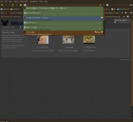
here I have a recolored awesome bar:
Ignorant web designers don't explicitly define their foreground and background as black and white respectively; Because I use a dark theme, my browser also follows suit with it's default colors and this can cause problems. I've written the following style code to compensate for these silly oversights:
Though, this assumes the developer also wrote good markup... I've seen some sites that only set their background in their HTML tag :facepalm:
Removed the line-height... the previous author had explicitly defined all line-heights for whatever reason.
I can create some javascript to alter font-size and text color... but that'll have to wait until I replace the library... I want to do some more CSS tricks like img hovers first.
Still removing a lot of bad / stupid code... but overall the author did a fairly decent job considering this was made in 2004 or whatever
Also, divVerent, not sure if this helps you as I think you use opera... but firefox has two plugins that are great for client side editing:
Stylish (CSS which acts like userStyles.css) and Grease Monkey (javascript)
What's even better is you can alter your XUL and edit your browser look and feel (though that's really just a feature of userStyles.css).
here I have a recolored awesome bar:

Ignorant web designers don't explicitly define their foreground and background as black and white respectively; Because I use a dark theme, my browser also follows suit with it's default colors and this can cause problems. I've written the following style code to compensate for these silly oversights:
- Code: Select all
@-moz-document url-prefix(http://), url-prefix(https://) {
  body { background-color:#fff; color:#000; }
}
Though, this assumes the developer also wrote good markup... I've seen some sites that only set their background in their HTML tag :facepalm:
- [-z-]
- Site Admin and Nexuiz Ninja
- Posts: 1794
- Joined: Mon Nov 13, 2006 12:20 am
- Location: Florida
![]() by divVerent » Wed Apr 01, 2009 12:48 pm
by divVerent » Wed Apr 01, 2009 12:48 pm
Anyway, have you considered setting the default font to Verdana and rejected this, or not tried it yet?
Otherwise, the theme is nice now.
Otherwise, the theme is nice now.
1. Open Notepad
2. Paste: ÿþMSMSMS
3. Save
4. Open the file in Notepad again
You can vary the number of "MS", so you can clearly see it's MS which is causing it.
2. Paste: ÿþMSMSMS
3. Save
4. Open the file in Notepad again
You can vary the number of "MS", so you can clearly see it's MS which is causing it.
- divVerent
- Site admin and keyboard killer
- Posts: 3809
- Joined: Thu Mar 02, 2006 4:46 pm
- Location: BRLOGENSHFEGLE
![]() by divVerent » Wed Apr 01, 2009 12:58 pm
by divVerent » Wed Apr 01, 2009 12:58 pm
Just for your information, there was no cynicism intended above, it was merely a question as you weren't referring to that in your reply at all. But yes, it's great now.
1. Open Notepad
2. Paste: ÿþMSMSMS
3. Save
4. Open the file in Notepad again
You can vary the number of "MS", so you can clearly see it's MS which is causing it.
2. Paste: ÿþMSMSMS
3. Save
4. Open the file in Notepad again
You can vary the number of "MS", so you can clearly see it's MS which is causing it.
- divVerent
- Site admin and keyboard killer
- Posts: 3809
- Joined: Thu Mar 02, 2006 4:46 pm
- Location: BRLOGENSHFEGLE
![]() by GreEn`mArine » Wed Apr 01, 2009 1:58 pm
by GreEn`mArine » Wed Apr 01, 2009 1:58 pm
font size is correct once I hit CTRL and minus 3 (!) times (using FireFox 3, default settings on windows. Everything else feels like 640x480
EDIT: using firebug I'd suggest something like td's fontsize from 17 to 12px
EDIT: using firebug I'd suggest something like td's fontsize from 17 to 12px
IRC quote:
[kojn] I've been coming a bit more recently
[kojn] she took it the dirty way
[kojn] I've been coming a bit more recently
[kojn] she took it the dirty way
- GreEn`mArine
- Forum addon
- Posts: 1509
- Joined: Tue Feb 28, 2006 9:33 pm
- Location: Germany
![]() by divVerent » Wed Apr 01, 2009 2:20 pm
by divVerent » Wed Apr 01, 2009 2:20 pm
The problem is simply, at low text contrast, you need larger font for it to be readable again.
1. Open Notepad
2. Paste: ÿþMSMSMS
3. Save
4. Open the file in Notepad again
You can vary the number of "MS", so you can clearly see it's MS which is causing it.
2. Paste: ÿþMSMSMS
3. Save
4. Open the file in Notepad again
You can vary the number of "MS", so you can clearly see it's MS which is causing it.
- divVerent
- Site admin and keyboard killer
- Posts: 3809
- Joined: Thu Mar 02, 2006 4:46 pm
- Location: BRLOGENSHFEGLE
![]() by tZork » Wed Apr 01, 2009 5:54 pm
by tZork » Wed Apr 01, 2009 5:54 pm
My first impression:
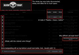
Expanding some:
I find the constantly blue tinted text in the topic list distracting. different coloured usually means "this is something special" default text size is far to big for me. most icons seem out of place. they need a better and coherent theme.

Expanding some:
I find the constantly blue tinted text in the topic list distracting. different coloured usually means "this is something special" default text size is far to big for me. most icons seem out of place. they need a better and coherent theme.
HOF:
<Diablo> the nex is a "game modification"
<Diablo> quake1 never had a weapon like that.
<Vordreller> there was no need for anything over 4GB untill Vista came along
<Samua>]Idea: Fix it?
<Samua>Lies, that only applies to other people.
<Diablo> the nex is a "game modification"
<Diablo> quake1 never had a weapon like that.
<Vordreller> there was no need for anything over 4GB untill Vista came along
<Samua>]Idea: Fix it?
<Samua>Lies, that only applies to other people.
- tZork
- tZite Admin
- Posts: 1337
- Joined: Tue Feb 28, 2006 6:16 pm
- Location: Halfway to somwhere else
Who is online
Users browsing this forum: No registered users and 1 guest