I don't know if I'm the only one that thinks this, but I really like Nexuiz.
Its fun
Its free
Its fun again
I just can't stand the logo.
I looked up the wiki and it means strength, which is cool.
I just don't think that it goes well at all with Nexuiz.
That, and I am not crazy about the main menu music, or even the main menu for that matter.
The character models could use some working on ( I've read in here that people are working
on character models.... I'm so excited from what I see!!! )
Now I wouldn't say anything about this, except that I just read on the some about page that
Nexuiz is a 'free, open source game.... that hopes to compete with other commercial games'
or something fairly close to that. I guess I can say that we all, at some level, would like to see a
lot more people on Nexuiz fragging with us.
I think the one big problem is that while its price, its accessibility, and its game-play make it great,
Nexuiz's theme is very confused.
There is the whole gore thing it had going with the carnage and 'frag' as a keyword.
There is the whole generic theme in the health packs and armor pickups
There are medieval castles?
There is the whole Nexgun, laser, glowing grapple, thing going on for a futuristic theme.
It has aliens and scary looking humas that look weird have some fairly confusing culture details.
Then there's the Japanese logo. Out of nowhere.
Okay so I've only been playing Nexuiz for about a month or two, so I'm not like an old Nex legend or anything;
I also know that its not a commercial game and doesn't have like all these funds to hire people.
However, I think we could use a change of the logo and some thematic touches should be implemented.
Once again, I love the looks of the new marine model coming out, more than any Nexuiz art so far.
I think it somehow it embodies a lot of the things that Nexuiz gameplay naturally suggests.
Okay so here's the list:
Even though I have no authority in Alien trap, I think these are valid suggestions.
Either way its my dream for Nexuiz
Lol
To me, the roots Nexuiz theme so far seems to be:
Generic ( free game, fast simple combat, open-source, old-school fps)
and
Future ( aliens, lasers, portals, space levels, bright hook )
*First I think that once those new marine models that look great are done, we should finnish remodeling all or most of the player models, making them the same quality and theme.
**Then once that hard work is done, we could have a logo design contest and have people submit their logos and we all vote on one that best suits Nexuiz.
Either that, or else I could start working on one, and you all critique it until we all agree on a good one.
***Then we redo some of the Menu UI to match the theme
(This would hopefully include cleaning up all of that boot-up looking text that comes up when loading a map. Just make it look better or something.
That info might be useful, but for new users, I know it scared me and I thought there was like a glitch the first time.)
****Then grab a bunch of the best maps and put them in with all of this, and get it released as the next big minor update to Nexuiz.
This should give Nexuiz some thematic definition so it can look good to new potential users.
Ok so none of this is completely necessary, but I don't think this is even as much work as making a whole map or stuff like that.
I know I would appreciate it for one.
And I would be less embarrassed to load it up and play it in front of my family (im 17)
And I wouldn't be so embarrassed to ask my friends to try it.
I might even dare to explain it when a girl accidentally overhears me speaking of it.
No, thats never gonna happen...
Should Nexuiz change their logo? Main Menu?
Moderators: Nexuiz Moderators, Moderators
15 posts
• Page 1 of 1
Sun Oct 19, 2008 7:11 am
-
You've raised some valid points here, it's just that the "confused" theme of Nexuiz is the only thing the developers and the community agree on, since everybody has different tastes and understandings of Nexuiz. And it allows for all kinds of custom content.
The only way i would see your suggestions manifesting is in the form of a new game based on the core of Nexuiz, concentrating on a more strict theme and storyline. But that wouldn't necessarily help Nexuiz.4m [PB] (amoebios)
This is Your world.- The mysterious Mr. 4m
- Forum addon
- Posts: 1402
- Joined: Wed Mar 01, 2006 6:03 pm
- Location: germany
-
It's a pretty common problem, that Open Source games appear to be stuck together from different pieces (in fact mainly because they really are ) If Nexuiz had just a single lead designer guy or something, it may have a more consistent art-style. But then, there's a problem with that Open in Open Source. It's a weird situation.
Since I'm a designer of some sort, I would appreciate a straight style approach. But the community has to be involved in such kind of changes.
Maybe we could have a voting, a "Nexuiz Style"-thread or something.
The main problem I see atm are the models anyway. So I don't expect major "style adjustments" in the near future.I'M BATMAN!-

HarryButt - Keyboard killer
- Posts: 560
- Joined: Thu Jan 17, 2008 4:51 pm
- Location: Hamburg, Germanistan
-
-
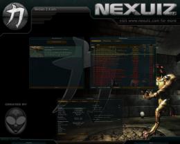
The Nexuiz logo (chikara) is the best thing about Nexuiz. To me it's what defines Nexuiz.
I'll come with more input once I have some time. Right now I have to get going to a thing.Grand HOWTO: http://forums.alientrap.local/viewtopic.php?t=4435
My Portfolio: www.kurotorobert.com
My 3D Blog: http://kuroto3d.blogspot.com/
___________
Oh mai-

ai - Forum addon
- Posts: 2131
- Joined: Sun Mar 05, 2006 3:54 pm
- Location: Behind you
-
-
i see this logo and just think : "Nexuiz! "
"
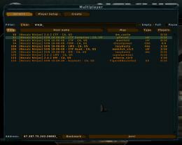
i don't know about the console thingie.. i like it more instead of a "Map Loading" or something picture..ginseng-

Mirio - Forum addon
- Posts: 1170
- Joined: Sun Apr 15, 2007 3:05 pm
- Location: Aneurysm
-
-
As a new player, I understand why you might be confused. I know a lot of older players feel a close connection with this logo, myself included. After playing the game for a while and getting used to the game play, I feel like the "strength" has a deep meaning in relation to the game play.
I find this a little insulting :-\.
The menu theme is getting updated, it was just a place holder for the new menu system divVerent wrote.
Here's my idea in progress.
In addition, if you did a little research in the forum, you'd see that the logo has been a staple in promoting Nexuiz. The whole campaign I've been working on will be thrown away if we strip the identity.
I think it's important to learn the culture values of a community before trying to change them.
I think the health and armor are quite good looking. They have a new wave Quake feel without going too far into the Warsow techiness. You have to look at these relative to what we had, not compared to retail games.
The medival castle you're talking about is a custom map... you downloaded it separate from the game. It's most likely ported from another Quake-based game. If you're going to judge maps, you should judge the ones that come with the game.
I don't want to see the logo changed
Welcome to the community.-

[-z-] - Site Admin and Nexuiz Ninja
- Posts: 1794
- Joined: Mon Nov 13, 2006 12:20 am
- Location: Florida
-


-
maybe this "theme by x" should be in the credits? but nice work.
Note: your ping sucks!
you can judge maps here: http://forums.alientrap.local/viewforum.php?f=18ginseng-
Mirio - Forum addon
- Posts: 1170
- Joined: Sun Apr 15, 2007 3:05 pm
- Location: Aneurysm
-
-
As for the menu, you may want to have a look at my Wicked skin versions ([-z-]'s remix is based on Wicked 1)
http://forums.alientrap.local/viewtopic.php?t=3430
http://forums.alientrap.local/viewtopic.php?t=3539-

sev - Alien
- Posts: 248
- Joined: Sat Mar 29, 2008 3:03 pm
- Location: Switzerland
-
-
Well, we can't include many of the available custom maps because they either don't match the art quality of e.g. Strahlemann and tZork, or they are not put under a license that would allow us including the map.
However, I'd be a against a consistent "art style" in the maps. Personal, I like the colorful things, and not the "industrial style" many mappers seem to prefer. And having all maps in the same style is one of the things I hate about Q3A. All the pentagrams everywhere. I am not a satanist!1. Open Notepad
2. Paste: ÿþMSMSMS
3. Save
4. Open the file in Notepad again
You can vary the number of "MS", so you can clearly see it's MS which is causing it.-

divVerent - Site admin and keyboard killer
- Posts: 3809
- Joined: Thu Mar 02, 2006 4:46 pm
- Location: BRLOGENSHFEGLE
-
-
Why is it that new peeps come in and demand that superficial things be changed? They don't like the logo: it gotta change. They don't like the skin: it gotta change. They don't like the maps: they gotta be tossed out and replaced. They don't like colerd lights: everything must be changed for them to monocrome.
They could change these things themselves ... but they never do. They could make new maps with the features they would like... but they don't. They just demand and demand and demand.
No: the logo won't be changed and if you want diffrent maps then make them.
__I__ make the maps I want to exist, I'm no professional... YOU can to.. but you probally won't do that either- take_this_cup_of_poison
- Banned
- Posts: 198
- Joined: Sun Jan 20, 2008 2:25 am
-
**Then once that hard work is done, we could have a logo design contest and have people submit their logos and we all vote on one that best suits Nexuiz.
Either that, or else I could start working on one, and you all critique it until we all agree on a good one.
Most companies never change their logo's. The'll mofiy their product many times and maybe tweak the logo just a little but but they hadly ever change their logo (i.e Coke, McDonallds. They may have been slightly modifiied but never changed 100%).
Would be fun having a competition though-

shaggy - Alien trapper
- Posts: 419
- Joined: Tue Apr 03, 2007 6:12 am
-
-
I like the logo. As for maps, if you want paricular thing you can learn to map yourself. See how challenging it is to actually design a map people consider 'good'.Possibly not the worst mapper in the world.
A blog of random pish:
http://xeno.planetnexuiz.com/blog/?author=5-

Sepelio - Forum addon
- Posts: 1101
- Joined: Tue Jun 27, 2006 7:57 pm
- Location: Scotland
-
-
Hehehe, you've really crossed a line there mate
Anyway, I feel the same as many other guys here. Nexuiz's logo means "Nexuiz" for me.
That surely won't change."One should strive to achieve; not sit in bitter regret."
WE ARE NEXUIZ.

-

C.Brutail - Laidback mapper
- Posts: 2357
- Joined: Tue Feb 28, 2006 7:26 pm
- Location: Ironforge
-
-
I like the Nexuiz logo.
It looks like pi.
I like pi. I only know it to about 10 places or so . I've been meaning to work on it.1.2.1 Forever
-

kozak6 - Alien trapper
- Posts: 418
- Joined: Wed Mar 01, 2006 9:22 pm
- Location: AZ
-
-
maybe this'll help:
http://3.141592653589793238462643383279 ... 944592.com4m [PB] (amoebios)
This is Your world.- The mysterious Mr. 4m
- Forum addon
- Posts: 1402
- Joined: Wed Mar 01, 2006 6:03 pm
- Location: germany
15 posts
• Page 1 of 1
Return to Nexuiz - General Discussion
Information
-
- Who is online
- Users browsing this forum: No registered users and 1 guest