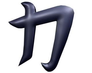
Bnonn wrote:If I may offer a suggestion, I think a brushed steel texture would look better for the metal part of the logo than the current dimpling. It would make it cleaner, more aggressive, and fit better with the blue edging. However, a few gashes or scars in the metal would also look pretty kewl.
I agree. I don't really think that current texture fits (you might not be done texturing but bringing it up anyway). And the "glow" extrusions could have more work to them. And make sure the bump's (I assume that's what you've been using here) aren't too deep as if it's going to rotate it will look bad. And yes, some beveling and make sure to have 2-3 segments. Depending how it blends in. But the bevel edge cannot be told how much but keep it rather small as Torus suggested. Depending how many edges/faces, in what direction etc. you select, it will have an impact on how much you actually can bevel. And if you work in Maya try not to go above 1. If you see no errors (which usually happen) larger than 1 than sure go ahead if it looks good.
I've done models where even 3 wasn't enough but that made it distorted which only screamed at me telling me not to bevel the way I did. So one needs to find ways around that.
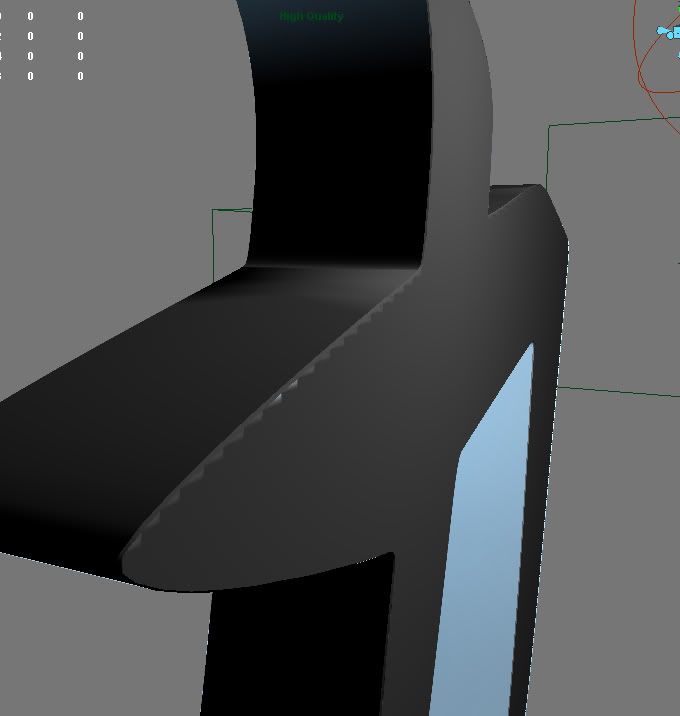
Anyway, the overall model look ok, it can be made better IMO, like don't have as much specularity and if it is glow or just transparent extrusions/polys make them stand out a bit. Also be aware of the edges of those glows, I see you might want a little more detail over there (the left end of that second pic).
That's my opinion as a fellow modeler. And btw, how long have you worked with 3D? (and/or Maya, if you've worked in other apps).