[Menu Skins] The Wicked Series (6 colours, meaner than Mean)

Post anything to do with editing Nexuiz here. Whether its problems you've had, questions, or if you just want to show off your work.

Moderators: Nexuiz Moderators, Moderators


  • I have been improving the Mean skin, made the design more consistent, the backgrounds a higher quality, and converted most of the images to grayscale, putting the colour information into the skinvalues.txt to make it easier to convert it to another colour.

    Wicked
    The Wicked Series, meaner than Mean (Red), but not yet Evil. :P

    I created these skins with "The GIMP", using "evil9" textures provided with Nexuiz (data20080511.pk3), the font "FreeMono Bold", and in-game screenshots from the maps:
    Basement by Garth Hendy (Wicked Black)
    Farewell by Tymo aka Henning Janssen (Wicked White)
    Aneurysm by Paul Evers (Wicked Red)
    Strength by Paul Evers (Wicked Yellow)
    Reslimed by Paul Evers, Mattrew Rye, Garth Hendy and Maik Merten (Wicked Green)
    Bleach by Paul Evers (Wicked Blue)

    I release the Wicked Series menu skins under the terms of the GNU General Public License as published by the Free Software Foundation, either version 3 of the License, or any later version.

    Please Note:You can get an improved Wicked 2 here
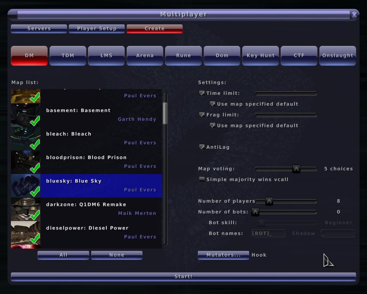
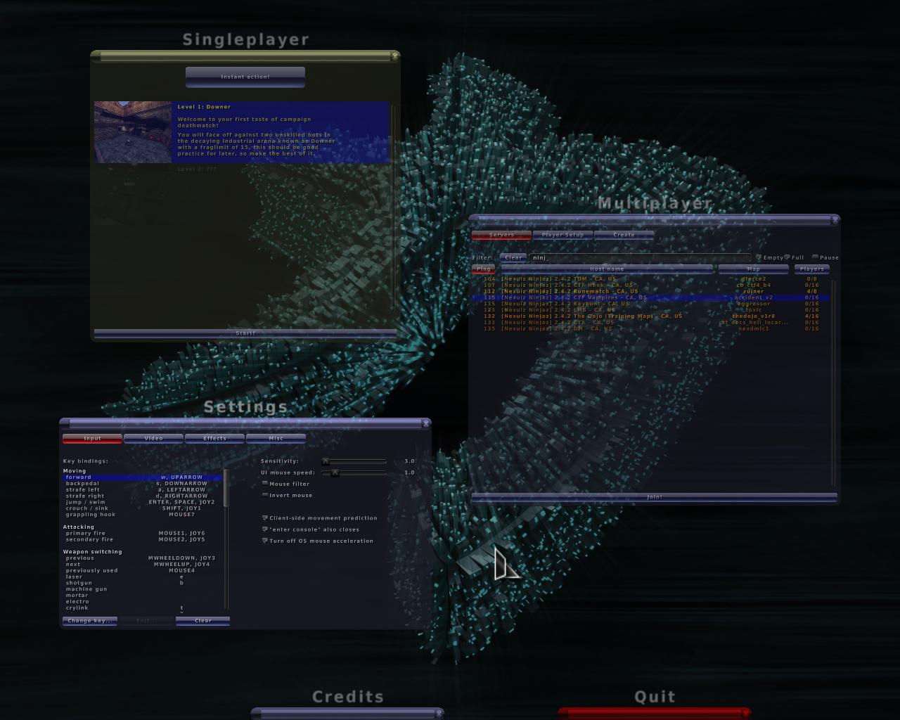
    Screenshots
    ImageImageImageImage
    ImageImageImageImage
    ImageImageImageImage

    How to use
    Put the wicked.pk3 pack into the "path to/nexuiz/data/" folder and...
    ...execute "menu_skin wickedcolour" and "menu_restart" in the console.
    OR
    ...change the key "seta menu_skin" in the config.cfg file to "wickedcolour".

    Obviously, replace colour with the colour you want to use, for example wickedwhite.
    Last edited by sev on Thu Apr 29, 2010 6:44 pm, edited 11 times in total.
    User avatar
    sev
    Alien
     
    Posts: 248
    Joined: Sat Mar 29, 2008 3:03 pm
    Location: Switzerland

Mon Jul 14, 2008 9:11 am

  • Wicked blue or black for default plz. :P
    I'M BATMAN!
    User avatar
    HarryButt
    Keyboard killer
     
    Posts: 560
    Joined: Thu Jan 17, 2008 4:51 pm
    Location: Hamburg, Germanistan

Mon Jul 14, 2008 9:35 am

  • Nice work! Back to black for me :)
    "It's a long story kid. You don't wanna hear it. I don't wanna tell it."
    User avatar
    dIM
    Alien
     
    Posts: 160
    Joined: Wed Mar 01, 2006 4:10 am
    Location: DD ger

Mon Jul 14, 2008 11:26 am

  • I already liked your red skin, so I keep this one, but again nice work :D


    Little thing without importance : COLOR_SCROLLBAR_C isn't a skinvalues.txt supported key...
    Ronan
    Alien trapper
     
    Posts: 292
    Joined: Tue Mar 20, 2007 10:25 pm
    Location: France

Mon Jul 14, 2008 12:05 pm

Mon Jul 14, 2008 12:37 pm

  • Ronan wrote:Little thing without importance : COLOR_SCROLLBAR_C isn't a skinvalues.txt supported key...


    I know, but this has no effect. This seems to be a bug, because the COLOR_SCROLLBAR_C is the only one that does not work, all the others like COLOR_SLIDER_C COLOR_BUTTON_C and so on do. I included it nevertheless, but I had to colour the scrollbar_c.tga files, otherwise they would have turned gray when clicked.
    User avatar
    sev
    Alien
     
    Posts: 248
    Joined: Sat Mar 29, 2008 3:03 pm
    Location: Switzerland

Mon Jul 14, 2008 12:49 pm

  • Fixed that in svn, but please remove the SCROLLBAR_C from your packs if you have applied the color to the scrollbar, or the scrollbar will be colored TWICE.
    1. Open Notepad
    2. Paste: ÿþMSMSMS
    3. Save
    4. Open the file in Notepad again

    You can vary the number of "MS", so you can clearly see it's MS which is causing it.
    User avatar
    divVerent
    Site admin and keyboard killer
     
    Posts: 3809
    Joined: Thu Mar 02, 2006 4:46 pm
    Location: BRLOGENSHFEGLE

Mon Jul 14, 2008 1:30 pm

  • divVerent wrote:Fixed that in svn, but please remove the SCROLLBAR_C from your packs if you have applied the color to the scrollbar, or the scrollbar will be colored TWICE.


    I know, but I am more comfortable with that (it would simply turn darker) than with gray scrollbars. If I would remove the SCROLLBAR_C value, then all the main images would be grayscale with the colour information in the skinvalues.txt, EXCEPT the scrollbar_c.tga.

    Now, one only needs to replace the scrollbar_c.tga with a copy of scrollbar_n.tga, and you have a clean version.
    I have done that and added a link in the first post to this clean version, with grayscale scrollbar_c.tga and SCROLLBAR_C in the skinvalues.txt, the way it is supposed to be :) .
    User avatar
    sev
    Alien
     
    Posts: 248
    Joined: Sat Mar 29, 2008 3:03 pm
    Location: Switzerland

Mon Aug 04, 2008 10:07 am

Mon Aug 04, 2008 11:39 am

  • morfar wrote:Ok, I added wicked_clean.pk3 to SVN. So it will be in next version of Nexuiz.
    But buttongray_d is missing in the skins!! Fix!


    Thanks for including it :).

    I checked it, and the buttongray_d images are included. But there was a space in the name (buttongray_d .tga). I didn't notice that, sorry.

    Uploaded a fixed version, it should work now (link is in 1. post).
    User avatar
    sev
    Alien
     
    Posts: 248
    Joined: Sat Mar 29, 2008 3:03 pm
    Location: Switzerland

Mon Aug 04, 2008 12:04 pm

Wed Aug 06, 2008 5:11 pm

  • [restructured from the conversation on #alientrap]

    I think it's a good base but some of the elements in the gui need clarification. If we're speaking in terms of usability, I'd say it's a step backwards.

    Scroll bars, sliders and checkboxes, all lack contrast and definition against the background. This can be confusing to any user, new or old.

    The checkboxes, the buttons and the inside of the main window are all square, which makes it a bit boring. Sure the insides of the buttons have some interesting details but the game type buttons are obviously stretched, something the 2.4 default theme hid pretty well. I'd go as far to say if this is going to be the new standard theme, it requires a code change to give game types a different background, otherwise it just looks bad.

    The selected map has a white background, which make white text with a black shadow hard to read.

    I think the blue theme is a better starting point but the contrast of the form elements must must must change.
    User avatar
    [-z-]
    Site Admin and Nexuiz Ninja
     
    Posts: 1794
    Joined: Mon Nov 13, 2006 12:20 am
    Location: Florida

Wed Aug 06, 2008 5:29 pm

  • :shock:
    "One should strive to achieve; not sit in bitter regret."
    WE ARE NEXUIZ.
    Image
    Image
    User avatar
    C.Brutail
    Laidback mapper
     
    Posts: 2357
    Joined: Tue Feb 28, 2006 7:26 pm
    Location: Ironforge

Wed Aug 06, 2008 5:29 pm

  • IF I would change something on the blue theme, it would be a little stitch of green into the control elements.
    I don't mind the contrast of the buttons to the BG, what I see is the contrast of the text itself. Imo it's not full white, though I may be wrong.
    I'M BATMAN!
    User avatar
    HarryButt
    Keyboard killer
     
    Posts: 560
    Joined: Thu Jan 17, 2008 4:51 pm
    Location: Hamburg, Germanistan

Wed Aug 06, 2008 7:00 pm

  • Hmmm... These don't seem to work for me.
    Image
    User avatar
    KillaGrunt
    Alien trapper
     
    Posts: 315
    Joined: Fri Jun 27, 2008 3:35 am
    Location: In your X-Box 360 playing halo

Wed Aug 06, 2008 8:08 pm

  • These are my interpretations of a menu skin. Of course, you do not have to use them.

    What I intended to do was to create some atmosphere, which the old ones completely lack, in my opinion. They should look dirty, and I reference to the evil textures (they are derived from evil textures), and in this way making the menu look like the maps that are played, creating a more consistent overall look.

    I use Wicked Yellow for quite some time now and do not have any problem with the contrast. Wicked White has a quite good contrast if that's what you are looking for.
    User avatar
    sev
    Alien
     
    Posts: 248
    Joined: Sat Mar 29, 2008 3:03 pm
    Location: Switzerland

Wed Aug 06, 2008 8:21 pm

  • I wasn't trying to insult your work, I was giving your my opinions on how it can be improved. What you see and everyone else sees are not always the same thing. You want to try and hit the widest range of people you can within a respective realm of interest, in this case, usability.

    I posted my comments because MrBougo had informed me that it was checked into SVN. While I think this is a change in a positive direction, going more towards the original grungy look the team was aiming for, I feel the usability has dropped from its plasticy predecessor.

    I believe implementing my suggestions will help improve the problems I've described in my previous post.
    User avatar
    [-z-]
    Site Admin and Nexuiz Ninja
     
    Posts: 1794
    Joined: Mon Nov 13, 2006 12:20 am
    Location: Florida

Wed Aug 06, 2008 8:31 pm

  • No sev thats not what I ment. I was trying to say that I can't use them . I did menu_skins wickedgreen but it seems that I put them in the wrong folder. And i did do menu_restart.
    Image
    User avatar
    KillaGrunt
    Alien trapper
     
    Posts: 315
    Joined: Fri Jun 27, 2008 3:35 am
    Location: In your X-Box 360 playing halo

Wed Aug 06, 2008 8:41 pm

Wed Aug 06, 2008 8:41 pm

  • KillaGrunt wrote:No sev thats not what I ment. I was trying to say that I can't use them . I did menu_skins wickedgreen but it seems that I put them in the wrong folder. And i did do menu_restart.


    It's "menu_skin wickedcolour" and "menu_restart".

    Did you put it in the data folder? In the right folder, there should also be the data20080511.pk3 file (if you use Nexuiz 2.4.2).

    Maybe you want to try to change the key "seta menu_skin" in the config.cfg file to "wickedcolour".
    User avatar
    sev
    Alien
     
    Posts: 248
    Joined: Sat Mar 29, 2008 3:03 pm
    Location: Switzerland

Wed Aug 06, 2008 8:45 pm

Wed Aug 06, 2008 9:07 pm

  • Of course I don't expect that everyone likes my works, and I am very thankful for suggetions. And I am sorry if I made the impression to consider yours insulting, because I don't. :roll:

    [-z-] wrote:What you see and everyone else sees are not always the same thing. You want to try and hit the widest range of people you can within a respective realm of interest, in this case, usability.


    True to some extend. But because the skin is basicly the first thing a (new) player sees from the game, it needs to look good first. And the plastic one doesn't, in my opinion. :P

    Maybe a short explanation about the selected map background colour:

    Every Wicked skin has got an "action colour". For example, Red has 0.75 0 0 (A bit darken than pure red). I used this colour for everything activated; activated buttons, radio buttons, checkboxes, colour and crosshair selection and names in the credits.

    And in Black and in White, the action colour is ... white. So the selected map background colour needs to be white as well, for the style to stay consistent throughout the series.
    User avatar
    sev
    Alien
     
    Posts: 248
    Joined: Sat Mar 29, 2008 3:03 pm
    Location: Switzerland

Wed Aug 06, 2008 10:19 pm

  • Thinking about it, this could be a solution (or a good feature in general): A new tab in the Settings menu with a list of all available skins (maybe even with a preview). This would make it as easy as possible to change the skin in real time, and to choose the one you like best, without having to search for them and using the console.
    User avatar
    sev
    Alien
     
    Posts: 248
    Joined: Sat Mar 29, 2008 3:03 pm
    Location: Switzerland

Wed Aug 06, 2008 10:35 pm

  • That sev... is a great idea. :D
    Image
    User avatar
    KillaGrunt
    Alien trapper
     
    Posts: 315
    Joined: Fri Jun 27, 2008 3:35 am
    Location: In your X-Box 360 playing halo

Thu Aug 07, 2008 3:12 pm

Thu Aug 07, 2008 3:14 pm

  • I'm so using wickedz :D :D :D
    Image
    User avatar
    KillaGrunt
    Alien trapper
     
    Posts: 315
    Joined: Fri Jun 27, 2008 3:35 am
    Location: In your X-Box 360 playing halo

Thu Aug 07, 2008 4:00 pm

Thu Aug 07, 2008 4:14 pm

  • It's good, you added dirt in your logos.
    This way they stay recognizable, but don't look too clean.

    I'd like it if the website would look this way.
    I'M BATMAN!
    User avatar
    HarryButt
    Keyboard killer
     
    Posts: 560
    Joined: Thu Jan 17, 2008 4:51 pm
    Location: Hamburg, Germanistan

Thu Aug 07, 2008 5:28 pm

  • From what i get its not that easy/practical to get a list of files/directories from the engine (due to security measures).. thats a problem for making a extra tab to select the skin.

    And i like Z's idea but maybe a thing inbetween would be nice. While Z's is almost to vibrant the currently used (in svn) wickedblack is too low contrast..
    User avatar
    esteel
    Site admin and forum addon
     
    Posts: 3924
    Joined: Wed Mar 01, 2006 8:27 am

Thu Aug 07, 2008 5:31 pm

  • Maybe thats because its supposed to be black :D
    Image
    User avatar
    KillaGrunt
    Alien trapper
     
    Posts: 315
    Joined: Fri Jun 27, 2008 3:35 am
    Location: In your X-Box 360 playing halo

Next


Return to Nexuiz - Editing


Information
  • Who is online
  • Users browsing this forum: No registered users and 1 guest