Thanks so far for the feedback.

The Credits and Quit buttons are out of place, future Nexuiz menus will use 5:4 aspect ratio on the menu no matter what the vid_con* values are to remain compatible with multiple monitor setups and etc. (We chose 5:4 because it fits with almost everything possible.) The problem here is that using a single image at the bottom which is increased in size just doesn't work with different monitor sizes as the background part of the menu doesn't care for the 5:4 ratio (Or any other ratio changes for that matter) -- I suggest taking a different idea for the background image of the theme or finding some way to solve this problem. Note: You should avoid doing this method for the top too, as again I mentioned multiple monitor usage would be interrupted by this.
EDIT: I read through the code and found a useful (yet seemingly undocumented) aligning method. Problem hopefully solved.
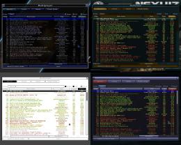
As mentioned before, perhaps you could make the colors a little more blue-based with text in the serverlist?
The reason why I kept these colours is their well known meaning. green = good ping, yellow = ok ping, red = bad ping. Apart from blueplastic, all skins use this colour coding, I think with good reason:
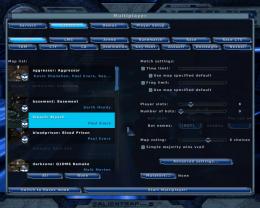
Take a look at the backgrounds here and compare that with another theme, the background of the singleplayer matches the maplist in other themes --- Perhaps check for other background color controls like this (Example: Serverlist or listbox global background color control) in the config. I don't have time to look at the config itself right now, sorry, else I would point out what needs changed.
Hmm... One important thing with the map selector is that the maps (unlike the other list items) can have different statuses: activated or deactivated.
To make it look like the other skins, I have to brighten the background to make the black list-item background stand out. It then looks like this:
I don't mind doing it this way (unless the background needs to be brighter, then it looks washed out), though beta2 has better contrast.
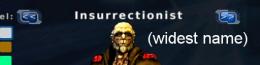
This just looks silly (We could probably extend the button size for this theme if we make it default, but i'm not sure if they would then be too big for the name of the model.)
This problem occurs because these 2 buttons override the 1:2:1 ratio of the buttons.
I can't do anything about this apart from making the "unscalable" parts at either side narrower, affecting ALL other buttons.
They simply should be extended, it shouldn't cause problems with the names.
And this needs to be red.
Done.
In return, I would have some suggestions for the menu:
The gametype buttons (multiplayer > create) should be reverted from bigbuttons to buttons, sice they are now the same size as the normal buttons.
I also suggest a different approach to missing image files. Instead of the checkered texture, it would be useful if an alternative image is used instead:
missing _f, _c --> use _n (only within the same activation status, i.e. c0 = n0, c1 = n1)
missing _d --> use _n with alpha 0.5
missing background_ingame_l* --> use background_l*
This would get rid of a lot of redundant data, while not removing any features or breaking compatibility of existing skins.
(In a test with wicked3, with the top half of the bg frame for ingame, this results in 30% fewer files (73 to 51) and 20% lower archive size)


