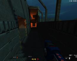
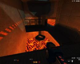
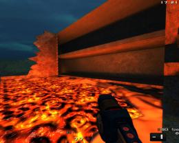
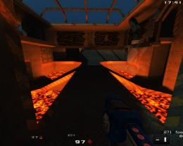
Screenshots of what you're doing

Post anything to do with editing Nexuiz here. Whether its problems you've had, questions, or if you just want to show off your work.

Moderators: Nexuiz Moderators, Moderators

Sat Dec 26, 2009 4:32 pm

  • Downward

    ImageImageImage
    ImageImageImage
    Aneurysm 4 the win !!!!! :D
    User avatar
    cortez
    Keyboard killer
     
    Posts: 805
    Joined: Wed Dec 06, 2006 7:22 pm
    Location: From the moon

Sat Jan 02, 2010 8:58 pm

  • Image

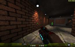
    early version, without any real lighting
    Aneurysm 4 the win !!!!! :D
    User avatar
    cortez
    Keyboard killer
     
    Posts: 805
    Joined: Wed Dec 06, 2006 7:22 pm
    Location: From the moon

Sun Jan 03, 2010 11:22 am

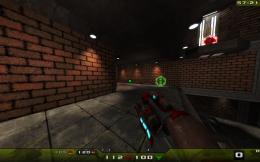
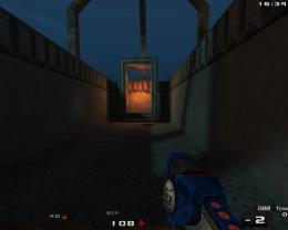
  • Great work cortez!I like very much contrast between blueish cold light and red warm light, very suggestive!
    keep going on!
    User avatar
    toneddu2000
    Alien trapper
     
    Posts: 251
    Joined: Mon Mar 09, 2009 7:56 pm
    Location: Italy

Mon Jan 04, 2010 1:52 pm

  • ImageImage
    Aneurysm 4 the win !!!!! :D
    User avatar
    cortez
    Keyboard killer
     
    Posts: 805
    Joined: Wed Dec 06, 2006 7:22 pm
    Location: From the moon

Mon Jan 04, 2010 5:59 pm

  • Plain floor on second screen... maybe add rusty trims near walls?
    Image
    User avatar
    Lord Canistra
    Member
     
    Posts: 25
    Joined: Sat Jan 02, 2010 11:34 pm
    Location: Tallinn, Estonia

Wed Jan 06, 2010 12:09 am

  • Looks promising cortez, let us know when it's done/beta testing :)
    :]

    Image

    kojn translates into horse.

    Signature Pic based on UT-Clan Mates describing trying to spam me and getting confused which routes I take :D
    k0jak
    Forum addon
     
    Posts: 1103
    Joined: Tue Feb 28, 2006 11:36 pm

Wed Jan 06, 2010 10:52 am

  • Yeah, looking rly nice, add those rusty trims though near the walls :p
    Image
    User avatar
    FruitieX
    Keyboard killer
     
    Posts: 588
    Joined: Mon Nov 13, 2006 4:47 pm
    Location: Finland

Wed Jan 06, 2010 2:22 pm

  • Image
    Aneurysm 4 the win !!!!! :D
    User avatar
    cortez
    Keyboard killer
     
    Posts: 805
    Joined: Wed Dec 06, 2006 7:22 pm
    Location: From the moon

Wed Jan 06, 2010 3:52 pm

  • Looks intersting :)
    What happened to downward?
    "One should strive to achieve; not sit in bitter regret."
    WE ARE NEXUIZ.
    Image
    Image
    User avatar
    C.Brutail
    Laidback mapper
     
    Posts: 2357
    Joined: Tue Feb 28, 2006 7:26 pm
    Location: Ironforge

Wed Jan 06, 2010 5:31 pm

  • That's what I mean, floor looks much better with these borders =^-^=
    Texture scales on the right and the left parts aren't equal.
    Image
    User avatar
    Lord Canistra
    Member
     
    Posts: 25
    Joined: Sat Jan 02, 2010 11:34 pm
    Location: Tallinn, Estonia

Wed Jan 06, 2010 7:30 pm

Wed Jan 06, 2010 8:01 pm

  • Hmm, new menu buttons? :)
    "One should strive to achieve; not sit in bitter regret."
    WE ARE NEXUIZ.
    Image
    Image
    User avatar
    C.Brutail
    Laidback mapper
     
    Posts: 2357
    Joined: Tue Feb 28, 2006 7:26 pm
    Location: Ironforge

Wed Jan 06, 2010 8:37 pm

  • @ Cortez666: Grr stop using the same wall and floor textures :( It does look nice though

    @ sev: Nice! I would perhaps make the checkboxes have a slightly smoother edge, and I would remove the dark circle in unselected radio buttons. Also: Try incorporating more yellow into the window/buttons/etc to match the background perfectly.
    Do it yourself, or stop complaining.
    (Developer Tracker) | (Nexuiz Roadmap)
    User avatar
    Samual
    Keyboard killer
     
    Posts: 508
    Joined: Mon May 25, 2009 7:22 pm
    Location: Pittsburgh, PA

Wed Jan 06, 2010 8:55 pm

  • to Lord Canistra: the scalings of the are equal but it doesnt look like that because the the pov is close to one wall

    to Samual: its easier that way and i can add the eyecandy afterwards
    Aneurysm 4 the win !!!!! :D
    User avatar
    cortez
    Keyboard killer
     
    Posts: 805
    Joined: Wed Dec 06, 2006 7:22 pm
    Location: From the moon

Wed Jan 06, 2010 9:14 pm

  • Samual wrote:@ sev: Nice! I would perhaps make the checkboxes have a slightly smoother edge, and I would remove the dark circle in unselected radio buttons. Also: Try incorporating more yellow into the window/buttons/etc to match the background perfectly.

    Thanks. It's WIP, and the background is still the old one. I will make use of the new features (layers and scaling methods), and yes, the skins will become more colourful (main colour + highlight colour).
    User avatar
    sev
    Alien
     
    Posts: 248
    Joined: Sat Mar 29, 2008 3:03 pm
    Location: Switzerland

Thu Jan 07, 2010 3:14 am

  • ImageImage
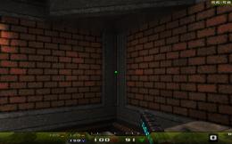
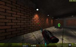
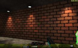
    No, i'm not retexturing Aggressor, i'm just making my own texture set ;) This is the first texture so far, only problem is you can see a line where the texture tiles for some reason... I can't get rid of it.. Also: I need to learn how to properly make norm maps, I made a bad one for the texture (Stole one from a TRaK4 texture and copy/pasted it then scaled it.... :P) as is, but I need to learn the proper way to do it.

    This btw is for cortez, so he has textures for his remake of downer.

    Made with gimp, for those who are wondering.. I had no source images, this is just lots and lots of filters.

    EDIT: Fixed the tiling issue and made a real norm map:
    ImageImageImage

    Moving on to the next texture now :)
    Do it yourself, or stop complaining.
    (Developer Tracker) | (Nexuiz Roadmap)
    User avatar
    Samual
    Keyboard killer
     
    Posts: 508
    Joined: Mon May 25, 2009 7:22 pm
    Location: Pittsburgh, PA

Thu Jan 07, 2010 4:06 pm

  • You managed that in GIMP?! Nice going. You will need to tell me how you did it in more detail. I don't have a clue about where to start for making my own textures.
    Possibly not the worst mapper in the world.

    A blog of random pish:
    http://xeno.planetnexuiz.com/blog/?author=5
    User avatar
    Sepelio
    Forum addon
     
    Posts: 1101
    Joined: Tue Jun 27, 2006 7:57 pm
    Location: Scotland

Thu Jan 07, 2010 5:07 pm

  • @cortez
    Looks interesting, lighting is a bit to flat for my liking tough.

    @sev
    Hm stylish, but maybe try a bit more variance in saturation? like maube less saturated dialog/background.

    @Samual
    Tiles are done by offseting the immage by half height/width and then retouching the border until it goes away. You may need to rince and repeat a few times as the editing can create new border artifacts.

    Im having a hard time telling if the the normalmap or the texture itself; but on those screenies it looks far to noisy, like a impressionists panting of a brick wall. Im guessing you generated the normalmap using the rgb data as source. that usually tunes out as crap, instead make a black and white hightmap (aka bumpmap) and convert to a normalmap and you will get far better results.
    HOF:
    <Diablo> the nex is a "game modification"
    <Diablo> quake1 never had a weapon like that.
    <Vordreller> there was no need for anything over 4GB untill Vista came along
    <Samua>]Idea: Fix it? :D
    <Samua>Lies, that only applies to other people.
    User avatar
    tZork
    tZite Admin
     
    Posts: 1337
    Joined: Tue Feb 28, 2006 6:16 pm
    Location: Halfway to somwhere else

Thu Jan 07, 2010 6:15 pm

  • tZork wrote:Tiles are done by offseting the immage by half height/width and then retouching the border until it goes away. You may need to rince and repeat a few times as the editing can create new border artifacts.
    Yeah, I figured that out.. I simply tiled two of them together and touched up the edges manually, then I copied one side to the other and cropped the image again.. This removed all tiling problems :)

    tZork wrote:Im having a hard time telling if the the normalmap or the texture itself; but on those screenies it looks far to noisy, like a impressionists panting of a brick wall. Im guessing you generated the normalmap using the rgb data as source. that usually tunes out as crap, instead make a black and white hightmap (aka bumpmap) and convert to a normalmap and you will get far better results.
    Ah, i'll try that then... Yes it looks like fuzz at the moment because of the normal map.
    Do it yourself, or stop complaining.
    (Developer Tracker) | (Nexuiz Roadmap)
    User avatar
    Samual
    Keyboard killer
     
    Posts: 508
    Joined: Mon May 25, 2009 7:22 pm
    Location: Pittsburgh, PA

Sun Jan 10, 2010 4:39 pm

Sun Jan 10, 2010 5:08 pm

  • sev wrote:α2
    -saturation +gloss
    Image

    DO WANT! :O
    Excellent work sir!
    If I were to decide, this would the default skin for 2.5.3.
    Image
    User avatar
    FruitieX
    Keyboard killer
     
    Posts: 588
    Joined: Mon Nov 13, 2006 4:47 pm
    Location: Finland

Mon Jan 11, 2010 9:44 pm

  • I'm with Fruitiex on that, this is pretty nice sven.
    fishsticks
    User avatar
    Rad Ished
    Keyboard killer
     
    Posts: 609
    Joined: Wed Jun 27, 2007 8:00 am
    Location: Not the Netherlands

Sat Jan 16, 2010 1:22 pm

Sat Jan 16, 2010 6:35 pm

Tue Jan 19, 2010 1:33 pm

  • why in the there isn't the new mortar animation in SVN?
    i think nexuiz really need animation like that...
    Ubuntoz
    Member
     
    Posts: 33
    Joined: Wed May 14, 2008 2:22 pm

Tue Jan 19, 2010 8:03 pm

  • @morfar, terragen 2?
    fishsticks
    User avatar
    Rad Ished
    Keyboard killer
     
    Posts: 609
    Joined: Wed Jun 27, 2007 8:00 am
    Location: Not the Netherlands

Tue Jan 19, 2010 8:39 pm

Wed Jan 20, 2010 5:55 am

  • FruitieX wrote:If I were to decide, this would the default skin for 2.5.3.
    I would rather have the wickedz theme with these buttons/controls :D
    Do it yourself, or stop complaining.
    (Developer Tracker) | (Nexuiz Roadmap)
    User avatar
    Samual
    Keyboard killer
     
    Posts: 508
    Joined: Mon May 25, 2009 7:22 pm
    Location: Pittsburgh, PA

Wed Jan 20, 2010 9:58 am

  • Samual wrote:
    FruitieX wrote:If I were to decide, this would the default skin for 2.5.3.
    I would rather have the wickedz theme with these buttons/controls :D

    These are just WIP screenshots. I'm working on a beta version, and when the graphics are tested, I'll make several colour versions (including a default candidate).
    User avatar
    sev
    Alien
     
    Posts: 248
    Joined: Sat Mar 29, 2008 3:03 pm
    Location: Switzerland

Thu Jan 21, 2010 4:38 am

  • sev wrote:
    Samual wrote:
    FruitieX wrote:If I were to decide, this would the default skin for 2.5.3.
    I would rather have the wickedz theme with these buttons/controls :D

    These are just WIP screenshots. I'm working on a beta version, and when the graphics are tested, I'll make several colour versions (including a default candidate).

    Ah, epic then. /me thinks everyone should donate to sev for his awesomeness :O
    Do it yourself, or stop complaining.
    (Developer Tracker) | (Nexuiz Roadmap)
    User avatar
    Samual
    Keyboard killer
     
    Posts: 508
    Joined: Mon May 25, 2009 7:22 pm
    Location: Pittsburgh, PA

PreviousNext


Return to Nexuiz - Editing


Information
  • Who is online
  • Users browsing this forum: No registered users and 1 guest