I've been working on a new theme for the AT forums

Post anything on anything here

Moderator: Moderators

Do you like polls?

I do
4
25%
I don't
2
13%
I just like to vote
3
19%
123405dsll1!!!! When's Nexuiz 2.5 coming out!?! LOLCATS, who gave me access to a computer?
5
31%
I have no idea what's going on, but this thread is EPIC
2
13%
 
Total votes : 16


  • I was sick of the late 90's style of the the current current, so I've been working on a new one with a refreshed style and BIGGER FONTS. It's still a work in progress but very useable.

    OLD:
    Image

    NEW:
    Image


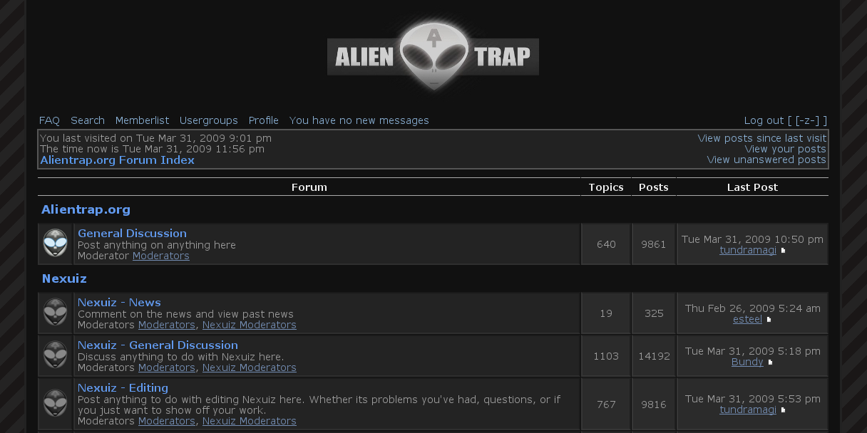
    EDIT: This is now the new default theme... welcome to a new era people!


    You can choose to use this theme in the control panel, it's called "Alien Infinitum" because I kept the original name of theme I've been building off located here. However, the name is subject to change in the future.


    Question, comments, critique, all welcome and maybe ignored. I plan on adding a few things to the theme still, remember it's a work in progress :)

    But I do appreciate constructive criticism and requests.


    Below are a few tests.

    fake name wrote:
    [-z-] wrote:My name is -z-!
    www.google.com is better than www.yahoo.com

    Code: Select all
    <?php
    echo "hello world!";
    $array = array(1,3,6,7,8,9,0);
    foreach ($array as $number) {
        for ($i=0;$i<$number;$i++) {
            echo "$i to $number";
        }
    }
    ?>

    http://pics.nexuizninjaz.com


      * one
      * two
      * give me back my shoe!!


    tiny
    small
    large
    HUGE

    darkred
    red
    orange
    brown
    yellow
    green
    olive
    cyan
    blue
    darkblue
    indigo
    violet
    white

    BOLD
    Italic
    underlined

    :D :) :( :o :lol: :oops: :twisted: :!:
    Last edited by [-z-] on Thu Apr 02, 2009 8:24 pm, edited 4 times in total.
    User avatar
    [-z-]
    Site Admin and Nexuiz Ninja
     
    Posts: 1794
    Joined: Mon Nov 13, 2006 12:20 am
    Location: Florida

Wed Apr 01, 2009 7:12 am

  • One thing I don't like about the new style is that the font is thin relative to its size.

    Can you brighten up the colors blue, darkblue, indigo?

    But it's clearly better than the default theme (which uses javascript to notify about PMs), and also much better as the white/blue one (which is just ugly).
    1. Open Notepad
    2. Paste: ÿþMSMSMS
    3. Save
    4. Open the file in Notepad again

    You can vary the number of "MS", so you can clearly see it's MS which is causing it.
    User avatar
    divVerent
    Site admin and keyboard killer
     
    Posts: 3809
    Joined: Thu Mar 02, 2006 4:46 pm
    Location: BRLOGENSHFEGLE

Wed Apr 01, 2009 7:31 am

  • very nice theme in general. Maybe the polls are a little too widespread and take a lot of (vertical) space. But I'm quite sure I'll keep using this theme now :D
    IRC quote:
    [kojn] I've been coming a bit more recently
    [kojn] she took it the dirty way
    GreEn`mArine
    Forum addon
     
    Posts: 1509
    Joined: Tue Feb 28, 2006 9:33 pm
    Location: Germany

Wed Apr 01, 2009 9:53 am

  • It does look nice, the font could be changed I believe. I also think you know this and are working on it but I'll throw it out anyway. Adding some kind of nice image/graphic to the different categories in the forums (Alientrap.org, Nexuiz, Nexuiz -Editing etc.).

    Also, I voted on: '123405dsll1!!!! When's Nexuiz 2.5 coming out!?! LOLCATS, who gave me access to a computer?'
    The whole thing is just funny, especially the end. Couldn't resist.
    User avatar
    ai
    Forum addon
     
    Posts: 2131
    Joined: Sun Mar 05, 2006 3:54 pm
    Location: Behind you

Wed Apr 01, 2009 10:46 am

  • I tried a few different fonts and font-weights wasn't really working out... I can make the font a little bigger and it'll look a little better but I dunno :-P. Guess I'm going to have to play with it some more. I've been adding little touches, icons, padding etc :D


    And yes, the poll padding needs work.


    What do you think of a larger font? I don't want to go too large >_<
    User avatar
    [-z-]
    Site Admin and Nexuiz Ninja
     
    Posts: 1794
    Joined: Mon Nov 13, 2006 12:20 am
    Location: Florida

Wed Apr 01, 2009 11:36 am

  • What a co-incidence! i was also planning on making some new themes! :o
    But i was thinking more along the lines of pink or Augenkrebs™®©¹¹¹¹∞-camouflage.
    4m [PB] (amoebios)

    This is Your world.
    The mysterious Mr. 4m
    Forum addon
     
    Posts: 1402
    Joined: Wed Mar 01, 2006 6:03 pm
    Location: germany

Wed Apr 01, 2009 11:42 am

  • I wouldn't like it larger, but it should be thicker... I am currently installing some more fonts so see how it works out. Maybe it's just that Bitstream Vera Sans sucks at this font size and this foreground/background color (the font does not look "thin" when black on white).
    1. Open Notepad
    2. Paste: ÿþMSMSMS
    3. Save
    4. Open the file in Notepad again

    You can vary the number of "MS", so you can clearly see it's MS which is causing it.
    User avatar
    divVerent
    Site admin and keyboard killer
     
    Posts: 3809
    Joined: Thu Mar 02, 2006 4:46 pm
    Location: BRLOGENSHFEGLE

Wed Apr 01, 2009 11:55 am

  • I found it.

    Can you make the regular text color at least #bbbbbb or brighter? That makes the text look good for me.

    As for font size, maybe ONE notch more, but not more then.
    1. Open Notepad
    2. Paste: ÿþMSMSMS
    3. Save
    4. Open the file in Notepad again

    You can vary the number of "MS", so you can clearly see it's MS which is causing it.
    User avatar
    divVerent
    Site admin and keyboard killer
     
    Posts: 3809
    Joined: Thu Mar 02, 2006 4:46 pm
    Location: BRLOGENSHFEGLE

Wed Apr 01, 2009 12:06 pm

  • 4m wrote:What a co-incidence! i was also planning on making some new themes! :o
    But i was thinking more along the lines of pink or Augenkrebs™®©¹¹¹¹∞-camouflage.


    Oh man, if I was farther along with the theme a few days ago I would have loved to make an "omg ponies" version ^_^.


    divVerent: making it too bright will be too much contrast and hurt many people's eyes.. I can bump it up a hex value but I think higher might be too much. You can always edit it client side.


    BUG: there is a bug with the lightbox script I have to look into... it matches <a><img> which it should not.

    Even worse, this thread is using a dated library (obviously) that's ~50kb bigger than it needs to be to perform the task... I've located the problem now I just need to write some clever javascript regex to fix it... I'll probably replace the script at some point... it's just a lot to do right now.
    User avatar
    [-z-]
    Site Admin and Nexuiz Ninja
     
    Posts: 1794
    Joined: Mon Nov 13, 2006 12:20 am
    Location: Florida

Wed Apr 01, 2009 12:24 pm

  • Overall I like it a lot, very clean, not too dark. :mrgreen:
    The font isn't really an issue, I use my own font settings anyway.

    2 problems I have though (Firefox 3.0.7):
    - I don't really like the image popup, and it only loads the thumbnail, not the link to the actual image.
    - When I open a link in a new tab (ctrl+lmb), it also opens it in the currently active tab.

    P.S. Alien Emoticons would be the cherry on top 8)
    User avatar
    sev
    Alien
     
    Posts: 248
    Joined: Sat Mar 29, 2008 3:03 pm
    Location: Switzerland

Wed Apr 01, 2009 12:25 pm

  • Well, low contrast is also bad for the eyes, as it makes reading the text harder.

    One thing I really hate is that even on current systems, the font suddenly changes from thin to thick when upping the font size. When I change it to 120% of the current size, it's all perfectly readable. But this is just the font size then where it changes from 1px thick to 2px thick (and it's actually why it looks better).

    Too bad using page zoom also makes images larger, which looks very ugly.

    As for "You can always edit it client side." - is there any "user friendly" way to do that? I know I can use the user style sheet feature and manually write a CSS file, but I bet I'm not the only user who has a hard time reading text at that low contrast and thin font.

    Also, when I try to increase the font size to a sensible value, I get problems with the line height, as you somehow broke the line height increasing together with the font size.

    EDIT: while I was writing this, I noticed that when now switching to Verdana instead of Bitstream Vera Sans, it actually looks good. Can you do that in the CSS, so everyone can get a nice readable font?

    Another thing... can you now also increase the line height? When selecting text, the selection marking overlaps the previous line...
    1. Open Notepad
    2. Paste: ÿþMSMSMS
    3. Save
    4. Open the file in Notepad again

    You can vary the number of "MS", so you can clearly see it's MS which is causing it.
    User avatar
    divVerent
    Site admin and keyboard killer
     
    Posts: 3809
    Joined: Thu Mar 02, 2006 4:46 pm
    Location: BRLOGENSHFEGLE

Wed Apr 01, 2009 12:30 pm

  • I stripped out the lightbox... maybe it'll come back once I replace the js library with jquery.

    Removed the line-height... the previous author had explicitly defined all line-heights for whatever reason.

    I can create some javascript to alter font-size and text color... but that'll have to wait until I replace the library... I want to do some more CSS tricks like img hovers first.

    Still removing a lot of bad / stupid code... but overall the author did a fairly decent job considering this was made in 2004 or whatever :-P.


    Also, divVerent, not sure if this helps you as I think you use opera... but firefox has two plugins that are great for client side editing:

    Stylish (CSS which acts like userStyles.css) and Grease Monkey (javascript)

    What's even better is you can alter your XUL and edit your browser look and feel (though that's really just a feature of userStyles.css).

    here I have a recolored awesome bar:
    Image


    Ignorant web designers don't explicitly define their foreground and background as black and white respectively; Because I use a dark theme, my browser also follows suit with it's default colors and this can cause problems. I've written the following style code to compensate for these silly oversights:

    Code: Select all
    @-moz-document url-prefix(http://), url-prefix(https://) {
      body { background-color:#fff; color:#000; }
    }


    Though, this assumes the developer also wrote good markup... I've seen some sites that only set their background in their HTML tag :facepalm:
    User avatar
    [-z-]
    Site Admin and Nexuiz Ninja
     
    Posts: 1794
    Joined: Mon Nov 13, 2006 12:20 am
    Location: Florida

Wed Apr 01, 2009 12:48 pm

  • Anyway, have you considered setting the default font to Verdana and rejected this, or not tried it yet?

    Otherwise, the theme is nice now.
    1. Open Notepad
    2. Paste: ÿþMSMSMS
    3. Save
    4. Open the file in Notepad again

    You can vary the number of "MS", so you can clearly see it's MS which is causing it.
    User avatar
    divVerent
    Site admin and keyboard killer
     
    Posts: 3809
    Joined: Thu Mar 02, 2006 4:46 pm
    Location: BRLOGENSHFEGLE

Wed Apr 01, 2009 12:56 pm

  • Chill with the cynicism, I was working on the poll results template...

    font is now verdana
    User avatar
    [-z-]
    Site Admin and Nexuiz Ninja
     
    Posts: 1794
    Joined: Mon Nov 13, 2006 12:20 am
    Location: Florida

Wed Apr 01, 2009 12:56 pm

  • Do whatever you want, but dont delete the current theme please :)
    User avatar
    Fisume!
    Alien trapper
     
    Posts: 467
    Joined: Sun Jan 27, 2008 8:55 am
    Location: Saarbruecken, Germany

Wed Apr 01, 2009 12:58 pm

  • Just for your information, there was no cynicism intended above, it was merely a question as you weren't referring to that in your reply at all. But yes, it's great now.
    1. Open Notepad
    2. Paste: ÿþMSMSMS
    3. Save
    4. Open the file in Notepad again

    You can vary the number of "MS", so you can clearly see it's MS which is causing it.
    User avatar
    divVerent
    Site admin and keyboard killer
     
    Posts: 3809
    Joined: Thu Mar 02, 2006 4:46 pm
    Location: BRLOGENSHFEGLE

Wed Apr 01, 2009 1:58 pm

  • font size is correct once I hit CTRL and minus 3 (!) times (using FireFox 3, default settings on windows. Everything else feels like 640x480 :P
    EDIT: using firebug I'd suggest something like td's fontsize from 17 to 12px
    IRC quote:
    [kojn] I've been coming a bit more recently
    [kojn] she took it the dirty way
    GreEn`mArine
    Forum addon
     
    Posts: 1509
    Joined: Tue Feb 28, 2006 9:33 pm
    Location: Germany

Wed Apr 01, 2009 2:20 pm

  • The problem is simply, at low text contrast, you need larger font for it to be readable again.
    1. Open Notepad
    2. Paste: ÿþMSMSMS
    3. Save
    4. Open the file in Notepad again

    You can vary the number of "MS", so you can clearly see it's MS which is causing it.
    User avatar
    divVerent
    Site admin and keyboard killer
     
    Posts: 3809
    Joined: Thu Mar 02, 2006 4:46 pm
    Location: BRLOGENSHFEGLE

Wed Apr 01, 2009 2:30 pm

  • [-z-] Can you make the "post" icon a little bigger?
    User avatar
    mand1nga
    Alien trapper
     
    Posts: 321
    Joined: Mon May 12, 2008 12:19 am

Wed Apr 01, 2009 5:54 pm

  • My first impression:

    Image

    Expanding some:
    I find the constantly blue tinted text in the topic list distracting. different coloured usually means "this is something special" default text size is far to big for me. most icons seem out of place. they need a better and coherent theme.
    HOF:
    <Diablo> the nex is a "game modification"
    <Diablo> quake1 never had a weapon like that.
    <Vordreller> there was no need for anything over 4GB untill Vista came along
    <Samua>]Idea: Fix it? :D
    <Samua>Lies, that only applies to other people.
    User avatar
    tZork
    tZite Admin
     
    Posts: 1337
    Joined: Tue Feb 28, 2006 6:16 pm
    Location: Halfway to somwhere else

Wed Apr 01, 2009 7:56 pm

  • [-z-] wrote:Though, this assumes the developer also wrote good markup... I've seen some sites that only set their background in their HTML tag :facepalm:


    Why? Is that bad? I set the background stuff at the begining of the html file... I don't use CSS... isn't that how it always has been done?
    tundramagi
    Forum addon
     
    Posts: 974
    Joined: Sun Jan 04, 2009 4:53 pm

Wed Apr 01, 2009 9:46 pm

  • It was done like this 12 years ago according to king netscape rules.

    New changes are good. Some polishing is needed, but thanks, z.
    Alien
    Forum addon
     
    Posts: 1212
    Joined: Tue Apr 22, 2008 7:12 am

Wed Apr 01, 2009 10:38 pm

Thu Apr 02, 2009 12:39 am

  • Well I know it's required by HTML but apparently not XHTML... however.. it's good practice to stick with that standard as it really is the first visual element you should be touching in the page. <title> and <head> come after <html>


    I'll keep working on the theme based on suggestions... they may be variants in the future... we'll see. I have a lot of other work to do, so don't necessarily expect instant changes but also don't think I've given up :-P I will continue to improve it.


    Not all the of the padding is perfect yet and the header is still being worked on... the previous author reused some classes that now used a bit differently so I have to expand that a bit... this is why you may look at some things and say "why is this style like this?"... probably because the author reused 'row2' where he should have used 'row_header' or something.

    I've been stripping out a lot of excessive <td>'s as well... because that's not how you design web pages. Not that I expect anyone to really be able to tell but this can result in a speed up in load time.
    User avatar
    [-z-]
    Site Admin and Nexuiz Ninja
     
    Posts: 1794
    Joined: Mon Nov 13, 2006 12:20 am
    Location: Florida

Thu Apr 02, 2009 3:17 am

  • Did some more tweaking... caved to the smaller font-size and brighter text... I suppose I should be the one writing client-side changes on top of what would be best for the average joe.
    User avatar
    [-z-]
    Site Admin and Nexuiz Ninja
     
    Posts: 1794
    Joined: Mon Nov 13, 2006 12:20 am
    Location: Florida

Thu Apr 02, 2009 1:21 pm

  • looks good :)
    User avatar
    Fisume!
    Alien trapper
     
    Posts: 467
    Joined: Sun Jan 27, 2008 8:55 am
    Location: Saarbruecken, Germany

Thu Apr 02, 2009 4:37 pm

Thu Apr 02, 2009 6:09 pm

  • Page contents (e.g. poll) do not fit in a window, so it makes it ugly.
    Alien
    Forum addon
     
    Posts: 1212
    Joined: Tue Apr 22, 2008 7:12 am

Thu Apr 02, 2009 6:12 pm

  • I think I like it. But do I like it enough... ?
    Shoe
    Keyboard killer
     
    Posts: 517
    Joined: Wed Mar 08, 2006 2:18 am

Thu Apr 02, 2009 6:42 pm

  • Alien wrote:Page contents (e.g. poll) do not fit in a window, so it makes it ugly.


    What the hell does this even mean? Do you expect me to see what you see? How about a screenshot?
    User avatar
    [-z-]
    Site Admin and Nexuiz Ninja
     
    Posts: 1794
    Joined: Mon Nov 13, 2006 12:20 am
    Location: Florida

Next


Return to General Discussion


Information
  • Who is online
  • Users browsing this forum: No registered users and 1 guest