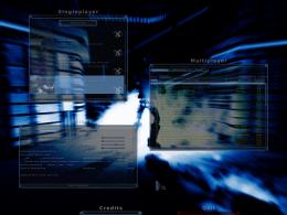
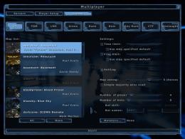
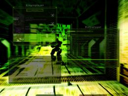
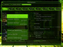
[Menu Skins] Wicked 2

Post anything to do with editing Nexuiz here. Whether its problems you've had, questions, or if you just want to show off your work.

Moderators: Nexuiz Moderators, Moderators

[Menu Skins] Wicked 2

Postby sev » Sun Aug 10, 2008 11:00 am

Thanks to -z- and esteel, whose suggestions encouraged me to create a better version of Wicked.

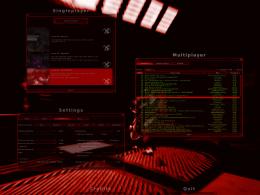
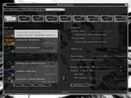
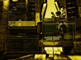
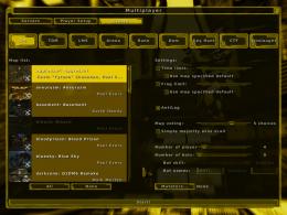
So here it is: Wicked 2

The main changes
- Most of the graphics are new
- The graphics are now much brighter, increasing contrast.
- The graphics are simpler and more distinguished, improving their scaling behaviour
- Less colour information in the graphics, only 3 of the 52 files contain colour (the others are grasyscale), making it as easy as possible to create new colour versions.
- Added some (modest) mouseover effects.

PLEASE NOTE: The scrollbar is not displayed correctly in Nexuiz 2.4.2, but will be in future versions.

Screenshots
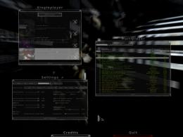
ImageImage
ImageImage
ImageImage
ImageImage
ImageImage
ImageImage

How to use
Put the wicked2.pk3 pack into the "path to/nexuiz/data/" folder and...
...execute "menu_skin wicked2colour" and "menu_restart" in the console.
OR
...change the key "seta menu_skin" in the config.cfg file to "wicked2colour".

Obviously, replace colour with the colour you want to use, for example wicked2white.
Last edited by sev on Thu Apr 29, 2010 6:44 pm, edited 4 times in total.
sev
Alien
 
Posts: 248
Joined: Sat Mar 29, 2008 3:03 pm
Location: Switzerland

Postby GreEn`mArine » Sun Aug 10, 2008 11:10 am

wicked. ;)

I picked the white one, its nice and neutral.
IRC quote:
[kojn] I've been coming a bit more recently
[kojn] she took it the dirty way
GreEn`mArine
Forum addon
 
Posts: 1509
Joined: Tue Feb 28, 2006 9:33 pm
Location: Germany

Postby HarryButt » Sun Aug 10, 2008 11:26 am

Looks more polished than v1.
Thumbs up. Image
I'M BATMAN!
HarryButt
Keyboard killer
 
Posts: 560
Joined: Thu Jan 17, 2008 4:51 pm
Location: Hamburg, Germanistan

Postby morfar » Sun Aug 10, 2008 11:47 am

much better. Commiting this to svn ;P
morfar
Site Admin
 
Posts: 938
Joined: Tue Feb 28, 2006 6:08 pm
Location: The Island

Postby torus » Sun Aug 10, 2008 1:36 pm

Looks fantastic, great work, I have no criticisms :)
Image
torus
Forum addon
 
Posts: 1341
Joined: Sun Dec 24, 2006 6:59 am
Location: USA

Postby dIM » Sun Aug 10, 2008 2:54 pm

Nice. Thanks again!
"It's a long story kid. You don't wanna hear it. I don't wanna tell it."
dIM
Alien
 
Posts: 160
Joined: Wed Mar 01, 2006 4:10 am
Location: DD ger

Postby Kryten » Sun Aug 10, 2008 3:41 pm

The darker backgrounds really make it easier on the eyes.

Awesome work :D
Kryten
Member
 
Posts: 12
Joined: Thu Jul 31, 2008 11:50 pm

Postby FruitieX » Sun Aug 10, 2008 6:28 pm

Very, very nice.

There's still something about the sliders and tickbox buttons that I don't like. Maybe the boxes should be filled with a color instead of that cross in them that's barely visible if ticked or not? And the sliders should look more simplistic to match the new big buttons. :)
FruitieX
Keyboard killer
 
Posts: 588
Joined: Mon Nov 13, 2006 4:47 pm
Location: Finland

Postby [-z-] » Mon Aug 11, 2008 1:24 am

Much better than the original, still a little eh... with the ticks and such but definitely an improvement.

div recently added a new image type for 'big buttons' i.e. gametype buttons to svn. This should help you put the final polish on.
[-z-]
Site Admin and Nexuiz Ninja
 
Posts: 1794
Joined: Mon Nov 13, 2006 12:20 am
Location: Florida

More contrast, please

Postby kanonmat » Tue Oct 21, 2008 1:29 am

Its a nice concept and I like it, one colour tinted grayscales. It's slicker than the old colour salad. The background image for wicked2green is a version of the pic i use for one of my desktops.

I like the black and yellow versions best, blue looks good, red and green versions are too coloured, white version is very hard to use. in the white menu, "Settings" window text is very hard to discern, especially with "r_textshadow 0". "Singleplayer" window is not much different when hovered (is that the right word?) or not. The background image have to fit with and provide contrast to the menu text and items, when clicked or when mouse pointer hovers above the item. Maybe that's difficult to do with only one colour tinting all.

The boxes that the player can fill look broken (no top border). They have to be distinguished, but I'd like it some other way.

Bug:
svn: (release 8528) Invalid key in skin file: MARGIN_INPUTBOX

The svn (release 8528) version menuskin is easier to use. The background image plays a part in that I think.

The (checked) checkboxes for VBO and texture compression are not consistent with the others.
Buttons for KeyHunt, Onslaught (and "Weapon order..." in svn) are too small for text. When clicked, the text on the buttons (all of them) is unreadable.

I would like subtler colours and more difference between unticked, hovered and ticked. Maybe more nuances.
(a k a macrobat)
And yes, Watchmen is the best graphic novel ever. Black Hole is quite nice too.
kanonmat
Member
 
Posts: 22
Joined: Sun Apr 20, 2008 8:42 pm
Location: Linköping, Sweden

Next

Return to Nexuiz - Editing

Who is online

Users browsing this forum: No registered users and 0 guests

cron